Expense Platform Redesign
In response to user feedback, I conducted a design system audit and a redesign of key features in an expense platform.
Skills
Prototyping, Design System Development, Information Architecture, CMS Design
Deliverable(s)
Hi-fidelity web platform prototype, Design system enhancements, Potential feature evaluation, Updated design system guidelines
Impact
Launched a new feature that yielded extremely positive feedback from Certify admins and increased engagement with the Certify platform.
Client
Certify
Tools
Figma, Figjam, Confluence
Role
Designer
Year
2023
Background
Prior to this project, customers routinely provided feedback about their Certify Expense experience; in their opinion, the platform was both visually outdated and lacking in several important features. Product stakeholders brought this issue to the design team, and we committed to improving the overall experience while also moving to a new design system.
Other products within the company ecosystem had already been moved to a new design system (Embark), leaving only a few platforms with a legacy UI.
OLD
NEW
Defining Business Value
Aligning Certify with the new Embark design system would make Emburse products tell a more compelling story to potential customers
Brand Identity
Build trust amongst Certify customers wishing for a platform that is on par with our competitors in the expense arena
Visual Design Update
Increase user engagement and adoption of the platform
Experience Enhancement
Defining Design Objectives
Visually unify Certify with other Emburse products for consistency
Fill major functionality gaps specified by users and stakeholders
Document the redesign for future designers and stakeholders that require the specs to continue the unification
Based on the proposed business value, I established the following objectives that I believed to be feasible with our timeline (one quarter) and available resources (internal users only, no customers).
Results: I expanded existing design guidelines to encompass more page patterns and maintain consistency across pages within the same product
Conducted an audit of current Certify designs
Prioritized features and defined their scope
Result: Clear roadmap and priorities for both design and engineering.
Iterate & Prototype based on feature matrix
Result: Prototypes for every prioritized feature ready to be implemented by engineering
Aligned with product stakeholders around impact and feasibility
Results: The Certify team was hugely receptive of the updated design guidelines because of the clear direction; they can make confident decisions moving forward.
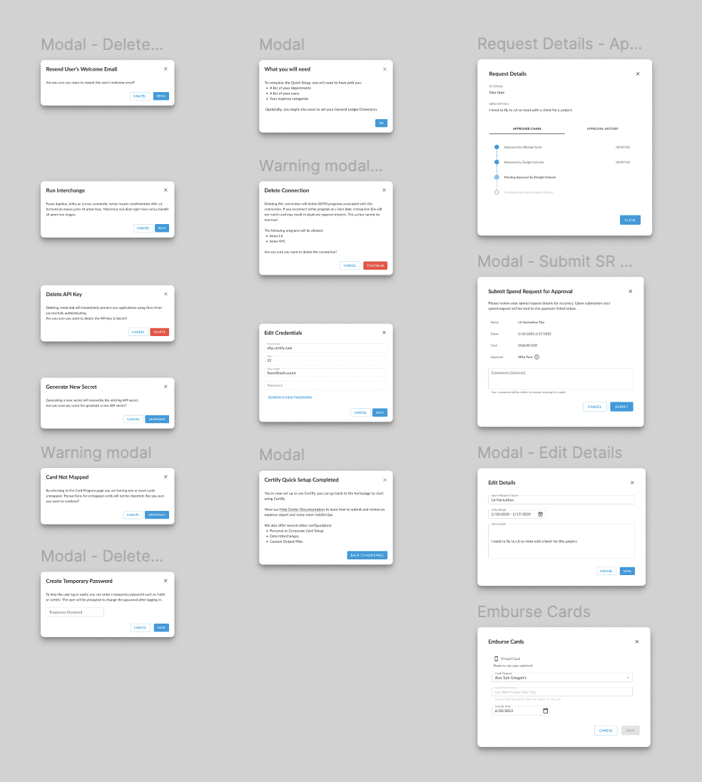
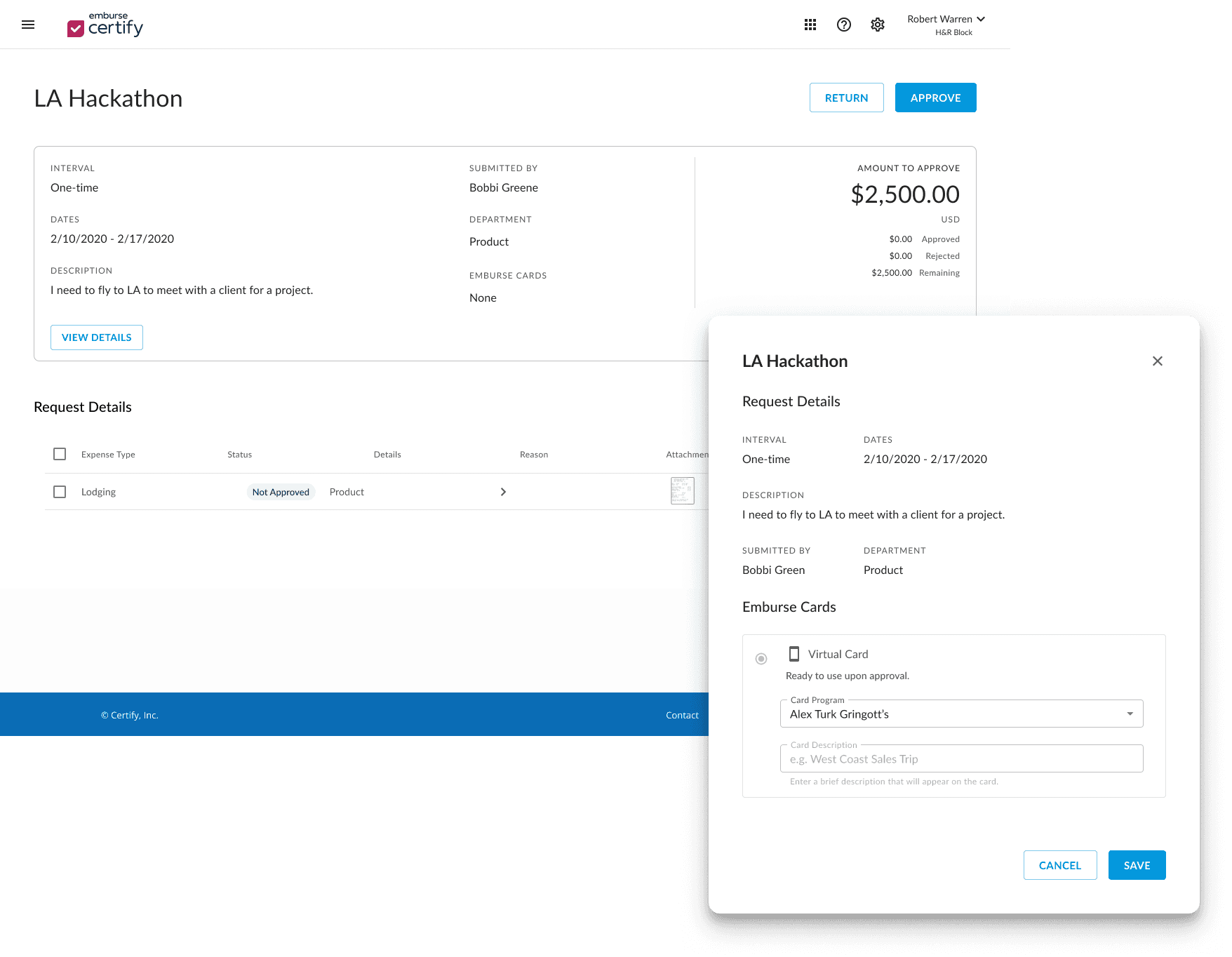
Request details modals are all too big - but still smaller than a full-page popup.
I made the SR modals the same size as other modals in either spend or AP, but here with the Certify Config page modals, they stand out.
Should we commit to a large modal size in anticipation of needing larger modals in the future? e.g. for expense reports?
Will review modals for SR and at the very least, change button size to Medium to match the others

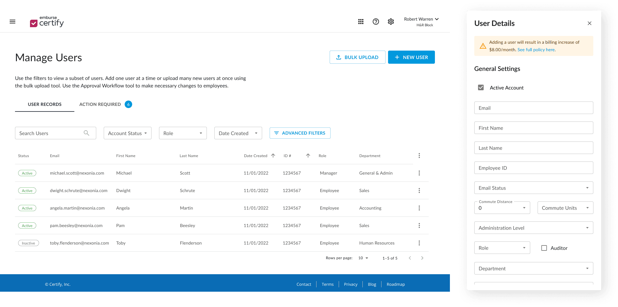
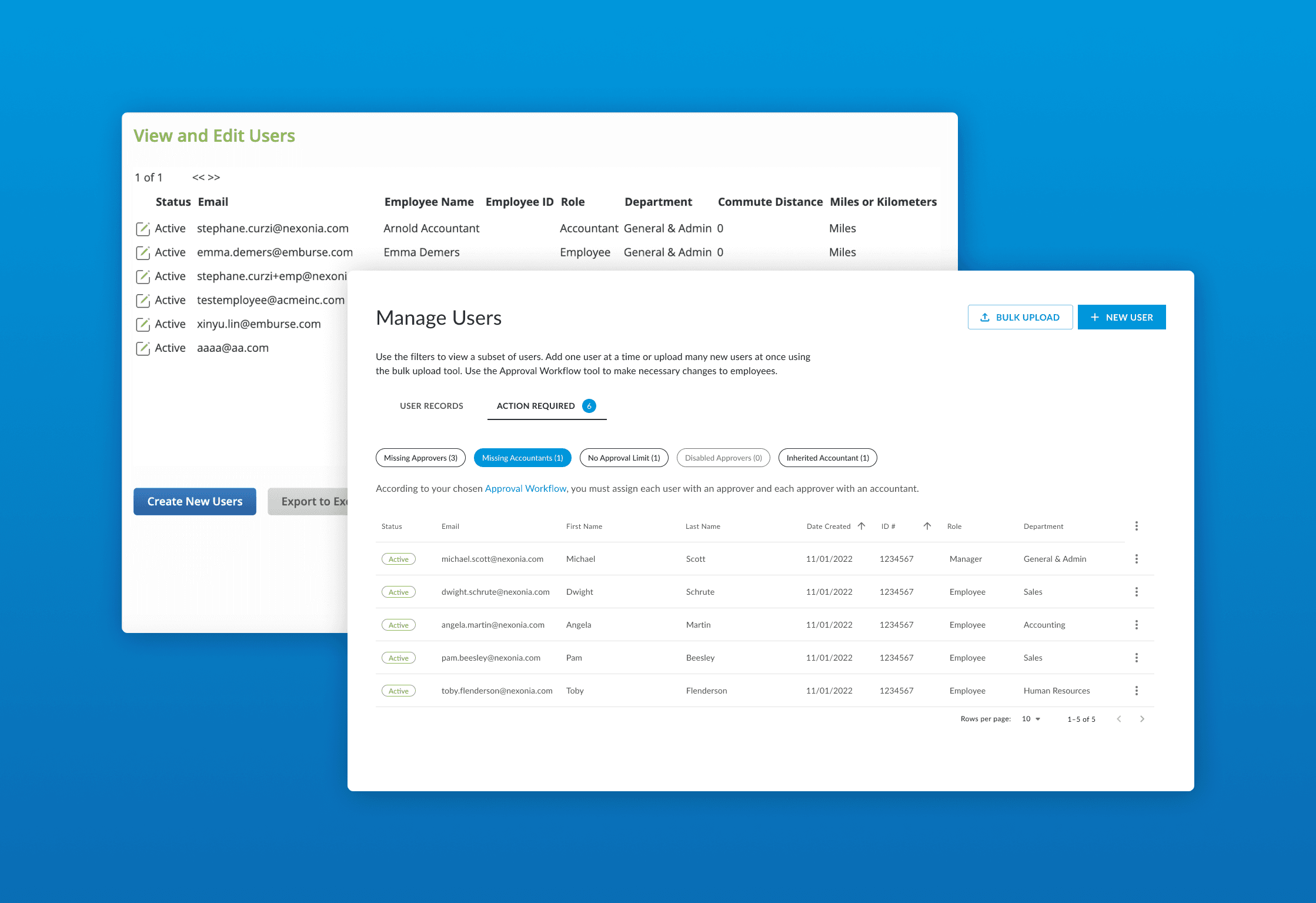
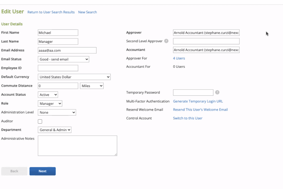
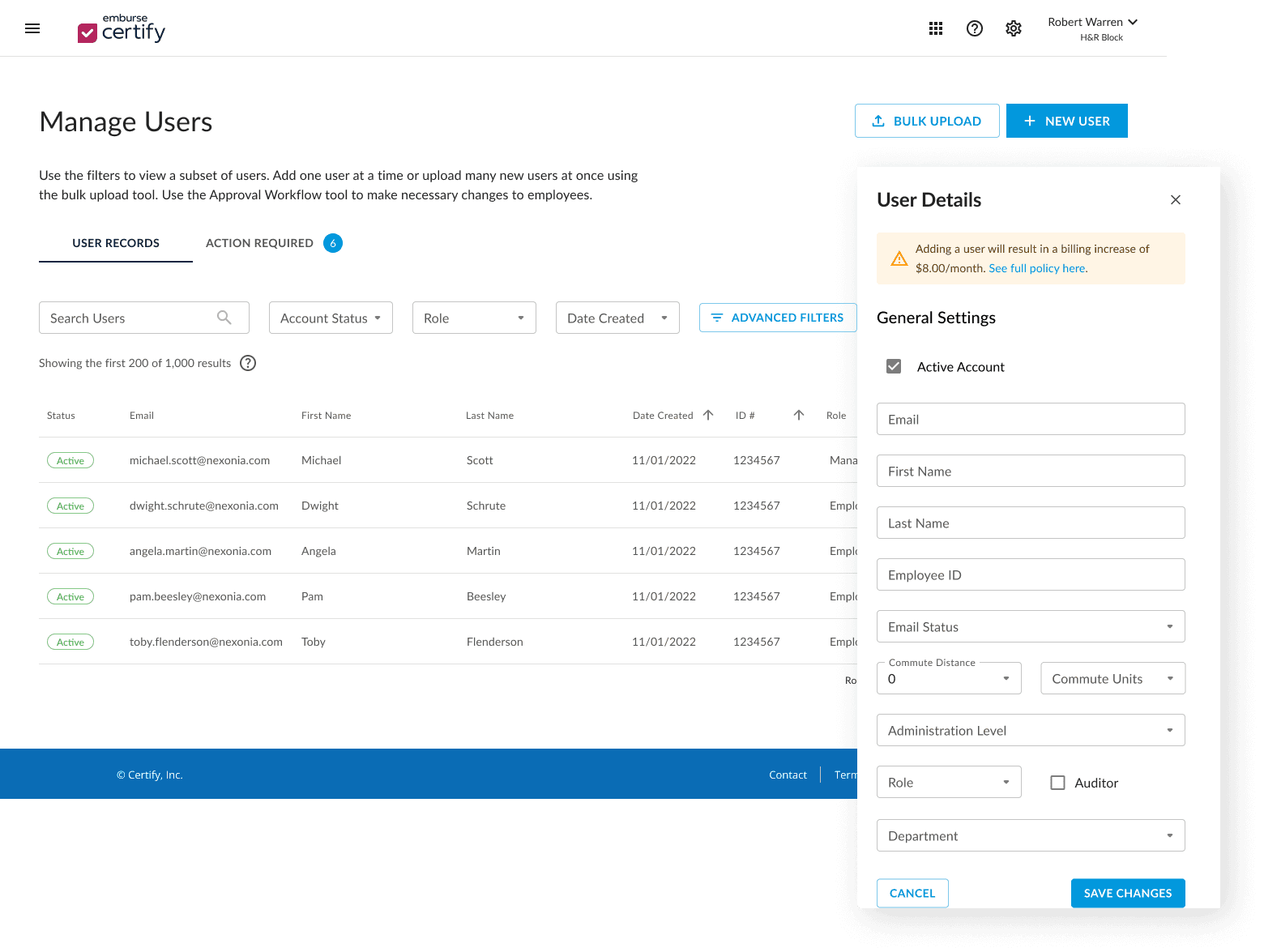
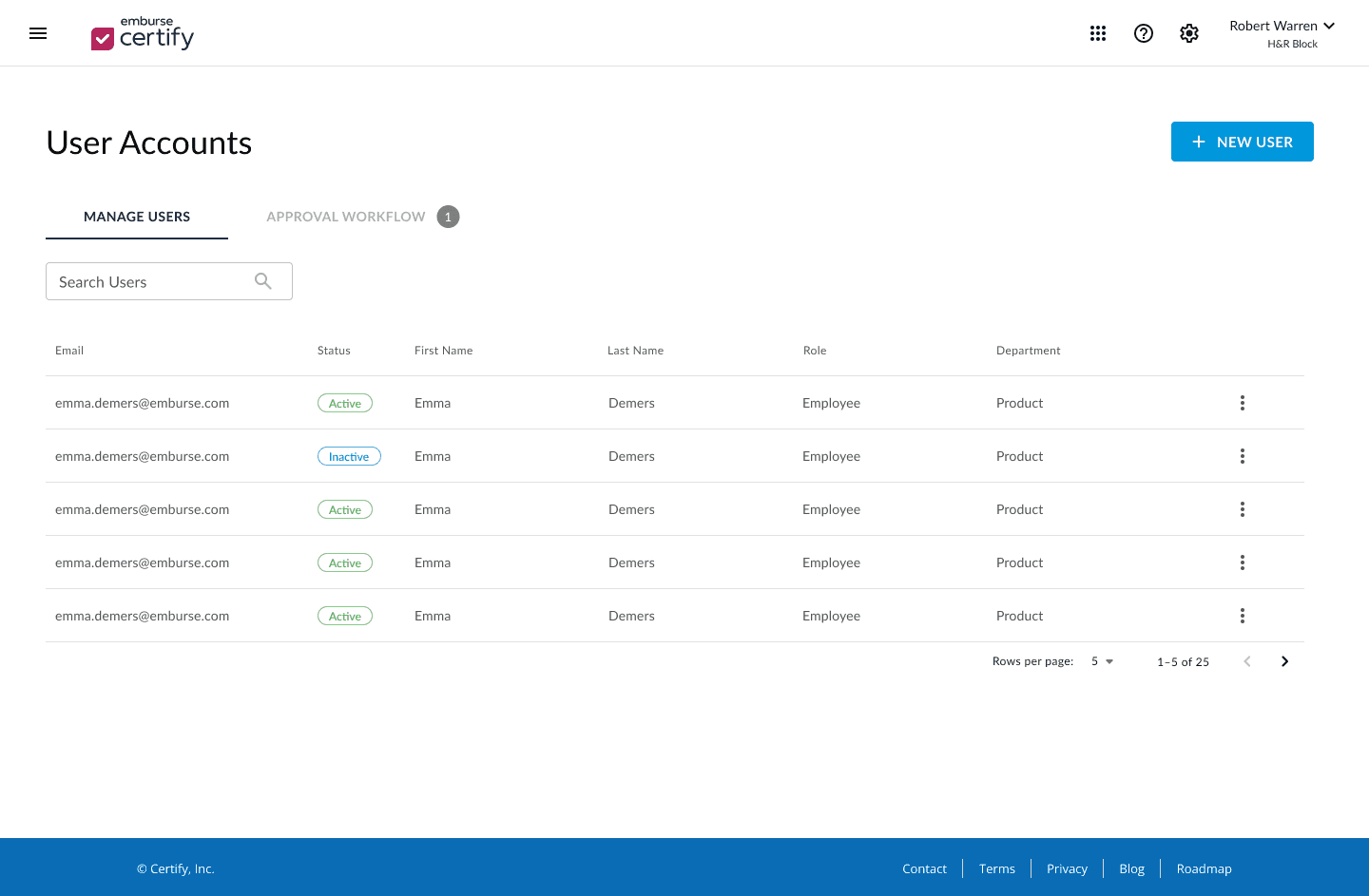
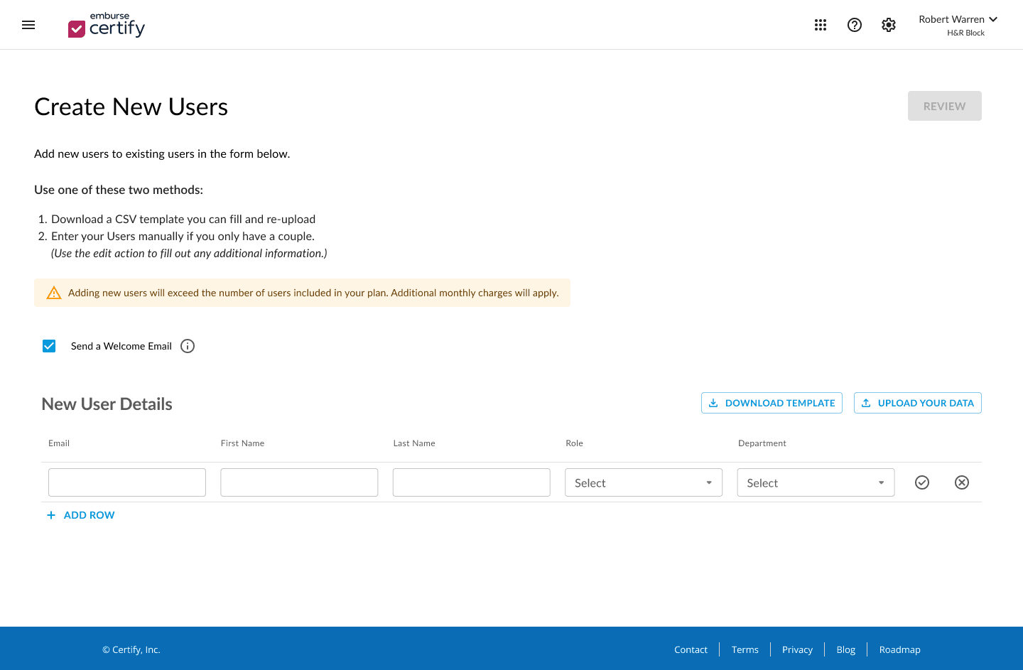
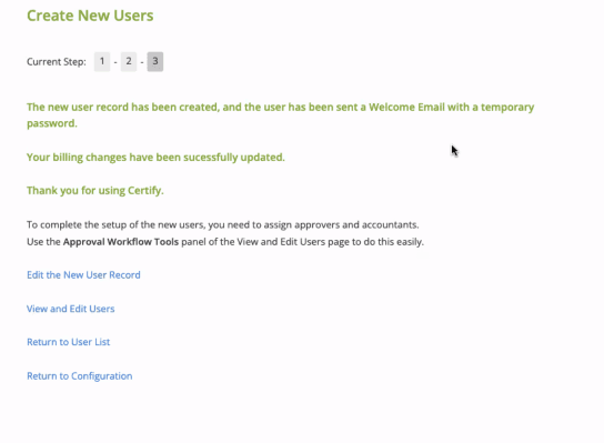
Solution: Unified the four experiences into one single page called “Manage Users” and included the approver assignment page as a second tab
v3 - combined all user-related actions into one screen with tabs for managing users vs. assigning approvers
v2 - played around with inline creation and small "add" buttons
Original - no visual hierarchy, all actions exist on the same plane
Original - old UI, actions are potentially unclear
v2 - elevate the request amount, add low-priority actions to the 3-dot menu, still use a collapsible "reason" column
v3 - move the request amount to a more visible area, elevate details in card format above the request, and place editable details in a modal

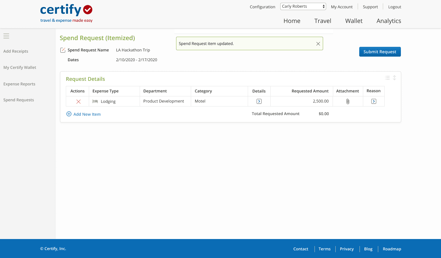
Solution: Went with a card view previously used by another designer in Certify’s invoice product
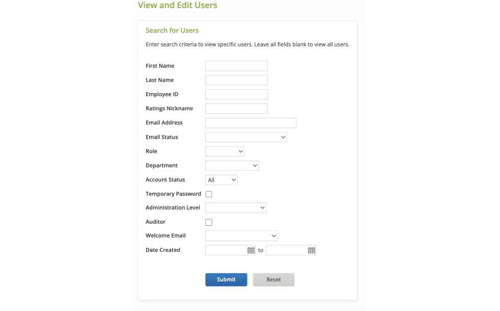
Feature: View/Edit User Records
Challenges:
The previous flow for viewing, editing, filtering/searching, and creating users all existed on different pages instead of being a single experience
Feasibility and Scope:
High priority given the amount of dissatisfied user feedback coupled with barriers to use. Engineering was ready to devote resources to this project.
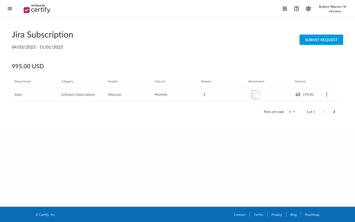
Feature: Spend Requests (Lump Sum, Recurring, Itemized)
Challenges:
Update the overview section while remaining consistent with other overview patterns from other platforms
Surface more prioritized actions
Feasibility and Scope:
Work already done during design audit to analyze available design patterns
Large-scale changes would require a slower rollout
Business Impact
During this project, I created two initiatives that both resulted in widespread impact across the Certify product teams.
Initiative
Design Guideline Augmentation
Initiative
Design System Updates
Action I Took
Conducted an audit of 50 updated Certify pages and analyzed them for consistency; drew up new guidelines to augment existing documentation, providing guidelines for components, patterns, pages, styling, and spacing
Action I Took
Spoke with the design system team to ensure any updates I make using the design system fall inside the capabilities of the design library we were building on
Impact
Consistent experience across platforms for users of multiple Emburse products increases familiarity with functionality
Enhanced design system increases the dynamic functionality of existing components, empowering users to do even more within the same platform and with less overhead
Impact
Having a “source of truth” decreases our time spent debating page specs like padding, spacing and size
Provide engineers with documentation to make retroactive edits for live pages
Easily see gaps in the system and plan future enhancements
Reception
At the final unification alignment meeting, I proposed the different pages, outlined the new feature capabilities with justifications tied to our users’ needs. Reception by stakeholders was positive and we were able to move forward immediately with implementation.
Response from customers has also been highly positive:
“I love the streamlined look and I find the results pull quicker in this set up. This is a time saving improvement and feels more modern, also.”
Key Takeaways
1.
Developing new design guidelines was detail-intensive work but paid dividends in efficiency for making subsequent design decisions.
Maintaining open lines of communication with other teams ensured confidence by the time we got to the prototyping stage.
2.
A holistic re-design brought our customers joy and set us up for future trust-building when we approach future re-designs of other heavy-traffic features
3.
Expense Platform Redesign
In response to user feedback, I conducted a design system audit and a redesign of key features in an expense platform.
Skills
Prototyping, Design System Development, Information Architecture, CMS Design
Deliverable(s)
Hi-fidelity web platform prototype, Design system enhancements, Potential feature evaluation, Updated design system guidelines
Impact
Launched a new feature that yielded extremely positive feedback from Certify admins and increased engagement with the Certify platform.
Tools
Figma, Figjam, Confluence
Role
Designer
Timeline
2023 (3 months)
Background
Prior to this project, customers routinely provided feedback about their Certify Expense experience; in their opinion, the platform was both visually outdated and lacking in several important features. Product stakeholders brought this issue to the design team, and we committed to improving the overall experience while also moving to a new design system.
Other products within the company ecosystem had already been moved to a new design system (Embark), leaving only a few platforms with a legacy UI.
OLD
NEW
Defining Business Value
Brand Identity
Brand Identity
Aligning Certify with the new Embark design system would make Emburse products tell a more compelling story to potential customers
Visual Design Update
Visual Design Update
Build trust amongst Certify customers wishing for a platform that is on par with our competitors in the expense arena
Experience Enhancement
Experience Enhancement
Increase user engagement and adoption of the platform
Defining Design Objectives
Visually unify Certify with other Emburse products for consistency
Fill major functionality gaps specified by users and stakeholders
Document the redesign for future designers and stakeholders that require the specs to continue the unification
Based on the proposed business value, I established the following objectives that I believed to be feasible with our timeline (one quarter) and available resources (internal users only, no customers).
Conducted an audit of current Certify designs
Results: I expanded existing design guidelines to encompass more page patterns and maintain consistency across pages within the same product
Request details modals are all too big - but still smaller than a full-page popup.
I made the SR modals the same size as other modals in either spend or AP, but here with the Certify Config page modals, they stand out.
Should we commit to a large modal size in anticipation of needing larger modals in the future? e.g. for expense reports?
Will review modals for SR and at the very least, change button size to Medium to match the others
Aligned with product stakeholders around impact and feasibility
Results: The Certify team was hugely receptive of the updated design guidelines because of the clear direction; they can make confident decisions moving forward.
Prioritized features and defined their scope
Result: Clear roadmap and priorities for both design and engineering.
Feature: View/Edit User Records
Challenges:
The previous flow for viewing, editing, filtering/searching, and creating users all existed on different pages instead of being a single experience
Feasibility and Scope:
High priority given the amount of dissatisfied user feedback coupled with barriers to use. Engineering was ready to devote resources to this project.
Feature: Spend Requests (Lump Sum, Recurring, Itemized)
Challenges:
Update the overview section while remaining consistent with other overview patterns from other platforms
Surface more prioritized actions
Feasibility and Scope:
Work already done during design audit to analyze available design patterns
Large-scale changes would require a slower rollout
Iterate & Prototype based on feature matrix
Result: Prototypes for every prioritized feature ready to be implemented by engineering
Solution: Unified the four experiences into one single page called “Manage Users” and included the approver assignment page as a second tab
Original - no visual hierarchy, all actions exist on the same plane
v2 - played around with inline creation and small "add" buttons
v3 - combined all user-related actions into one screen with tabs for managing users vs. assigning approvers
Original - old UI, actions are potentially unclear
v2 - elevate the request amount, add low-priority actions to the 3-dot menu, still use a collapsible "reason" column
v3 - move the request amount to a more visible area, elevate details in card format above the request, and place editable details in a modal
Solution: Went with a card view previously used by another designer in Certify’s invoice product
Business Impact
During this project, I created two initiatives that both resulted in widespread impact across the Certify product teams.
Initiative
Design Guideline Augmentation
Action I Took
Conducted an audit of 50 updated Certify pages and analyzed them for consistency; drew up new guidelines to augment existing documentation, providing guidelines for components, patterns, pages, styling, and spacing
Impact
Having a “source of truth” decreases our time spent debating page specs like padding, spacing and size
Provide engineers with documentation to make retroactive edits for live pages
Easily see gaps in the system and plan future enhancements
Initiative
Design System Updates
Action I Took
Spoke with the design system team to ensure any updates I make using the design system fall inside the capabilities of the design library we were building on
Impact
Consistent experience across platforms for users of multiple Emburse products increases familiarity with functionality
Enhanced design system increases the dynamic functionality of existing components, empowering users to do even more within the same platform and with less overhead
Reception
At the final unification alignment meeting, I proposed the different pages, outlined the new feature capabilities with justifications tied to our users’ needs. Reception by stakeholders was positive and we were able to move forward immediately with implementation.
Response from customers has also been highly positive:
“I love the streamlined look and I find the results pull quicker in this set up. This is a time saving improvement and feels more modern, also.”
Key Takeaways
1.
Developing new design guidelines was detail-intensive work but paid dividends in efficiency for making subsequent design decisions.
Maintaining open lines of communication with other teams ensured confidence by the time we got to the prototyping stage.
2.
A holistic re-design brought our customers joy and set us up for future trust-building when we approach future re-designs of other heavy-traffic features